In the last year, food packaging designs for big brand names such as Girl Scout Cookies and Vitaminwater underwent minor, major and, at times, truly inspired changes. While Diet Coke refashioned its iconic can into a fragmented, minimalist work of art, Campbell's Soup launched a bold (to say the least) line of soup pouches targeting the coveted "young and hip" demographic. See it to believe it:
1. CAMPBELL'S SOUP
In an intrepid effort to corner the hipster market, Campbell's has released a line of exotically-flavored, ready-to-eat soup pouches. According to Darren Serrao, their North American VP of innovation. Campbell's Go! Soup pouches cater to the vaguely-defined "Millenials" with "high expectations" and "finicky palates." With ingredients ranging from quinoa to coconut curry, an elevated price tag ($2.99 as opposed to Campbell's signature $0.99 cans) and a marketing campaign replete with a Tumblr-inspired website, kitten .gifs, thought bubbles, soup-inspired Spotify playlists and pictures of a traveling soup pouch, Campbell's brave new design is destined for cult status amongst only the hippest of soup-guzzlers. Oh, and Stephen Colbert dubbed it "America's hottest liquid food trend."

2. DIET COKE
At the end of the summer, Diet Coke unleashed a new look created by Turner Duckworth, the San Francisco-based design agency, in which the brand's well-known logo is cropped down the "D" in "Diet" and the "k" in "Coke." This minimalist remake establishes the Diet Coke's signature logo as an iconic image with no need for words, entirely recognizable even by its fragments.

3. GIRL SCOUT COOKIES
Girl Scout Cookie packaging receive a "facelift" in 2012, their 100-year anniversary. The new packaging design emphasizes the five real-world-applicable skills Girl Scouts learn: goal setting, decision making, money management, people skills, and business ethics. The packaging's images display Girl Scouts in the middle of an activity — kayaking, gardening and giving a speech. The point being, we don't buy Girl Scout Cookies merely to taste their cookie goodness. We buy Girl Scout Cookies because we're investing in the future of the girls selling them.

4. TEACHER'S SCOTCH WHISKEY
Teacher's Scotch Whiskey's new bottle design gives the whiskey a sleeker, more modern appearance.Without betraying its classic look, the retouched labeling seeks to play up the packaging's visual appeal with a more memorable redesigned logo icon, a nostalgia-inducing image of the brand's distillery in Scotland, by cutting down on text (or, at least, the size of the text) and by showing less label (and more of the whiskey's rich, golden color).

5. VILLAGE FARMS
Village Farms released their redesigned food packaging: an all-American farm town drawn in soft shades of beige and maroon and a down-to-earth logo bearing the brand name ("village" is in cursive and "farm" is in print). The produce packaging redesign centers around a one-to-two word adjective to draw attention to it, hoping to elicit an associative response. For example, the words in the largest font, by far, on Village Farm's produce packaging are: juicy, luscious, sweet, delectable, lip smackn' and savory. Rather than confuse consumers with the esoteric names of particular produce, the packaging emphasizes, in one memorable word, the way a consumer will feel about their product.

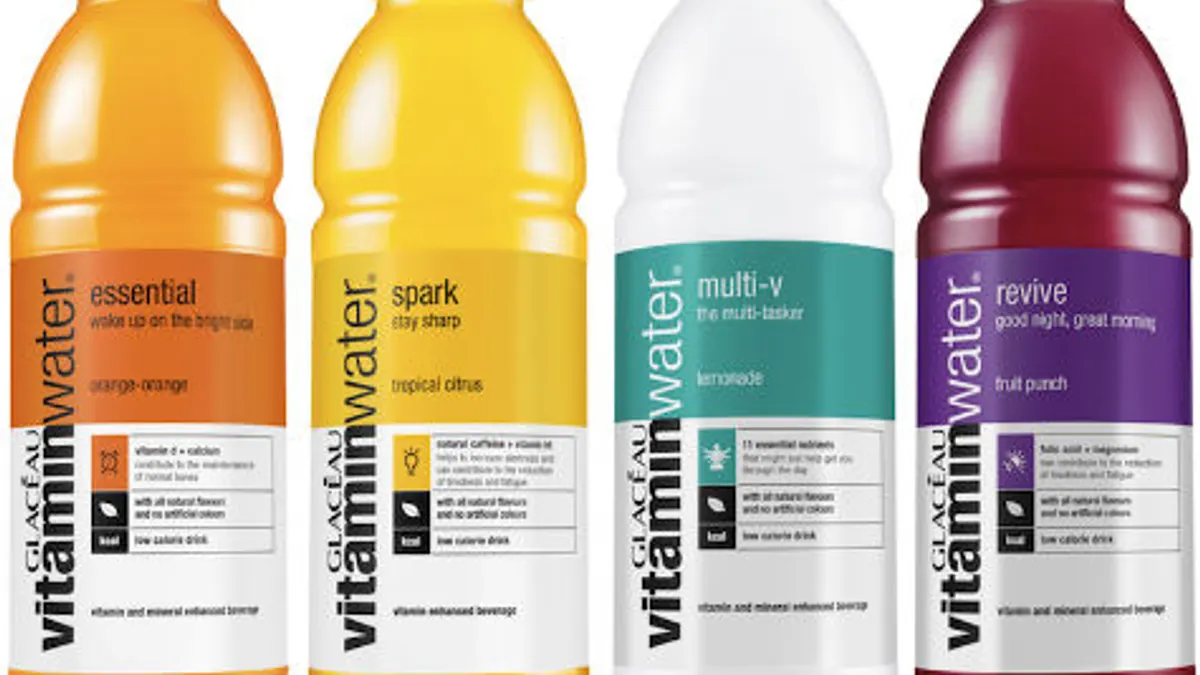
6. GLACEAU VITAMINWATER
Glacéau vitaminwater recently released new packaging for their line of flavored waters with redesigned labels containing updated copy and new iconography to illustrate the effects of each flavor.

Would you like to see more food and beverage industry news and information like this in your inbox on a daily basis? Subscribe to our Food Dive email newsletter! You may also want to check out our 10 favorite limited edition alcohol packaging designs.