Regional grocers rely on strong customer loyalty as they strive to compete with national chains on their home turf — and they create much of that loyalty through compelling apps and other online platforms.
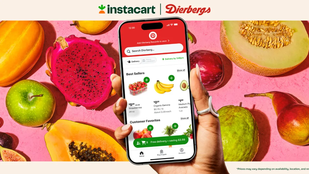
Shoppers have become highly familiar with digital shopping tools, of course, and regional grocers have taken steps to accommodate them with innovative tools, such as offering digital circulars, multiple e-commerce options, touch-free checkout and targeted ads.
Regional grocers can leverage their knowledge of their smaller, more condensed customer bases and incorporate shoppers’ wants into their apps to stand out. But they also can attract Gen Z shoppers, like myself, simply by streamlining their digital platforms.
Gen Z — defined by demographers as people born in 1997 or later — makes up 11% of online-reliant shoppers, and consumers in this cohort spend 20% of their grocery shopping dollars online, according to FMI — The Food Industry Association’s most recent U.S. Grocery Shopper Trends report.
While regional grocers might not have the technological capabilities that larger competitors possess, they can help make up for that reality by using their understanding of local preferences to attract shoppers — especially younger consumers known for their tech savviness.
There is a significant amount of overlap between apps. Each offers a variety of mainstream services, but some regional grocers offer features that outpace what their competitors provide and enable a more streamlined digital shopping experience. Even details as slight as the presentation and layout of the app can make a difference in attracting Gen Z customers.
Here is a look at three key app elements and how several regional grocers are making the most of them.
Digital circulars
The switch to digital circulars has been a hot-button topic throughout the grocery industry this year — and also something grocers can’t seem to settle on. Giant Eagle, for example, reportedly stopped sending printed circulars only to revive it for customers in the Cleveland area a few months later.
Publix, Cub Foods and Schnuck Markets all put their digital weekly circulars front and center on their homepage, offering ways for customers to maximize their shopping experience.
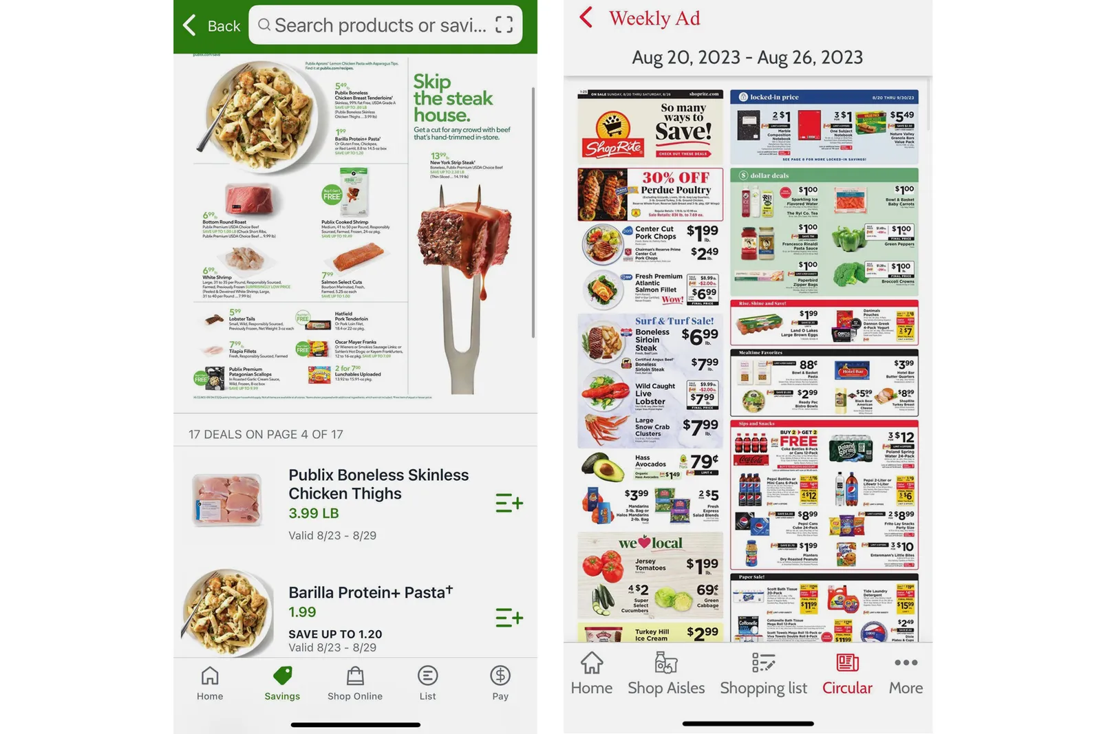
Publix’s app enables customers to peruse not only that week’s circular, but the upcoming week’s as well to get ahead on deals. A majority of the grocer’s weekly ad features shoppable recipes and, for each page of the circular, Publix provides a digital list of the food items and ingredients shown, allowing customers easily to add products to their in-app virtual shopping list.
Cub and Schnucks have kept the classic look for their circulars, which are packed with discounts and promotions, but both grocers offer more than that on the app.
Cub has additional circulars available that span multiple weeks and focus on specific categories, including liquor and seasonal foods. Meanwhile, Schnucks takes a similar approach to Publix, letting shoppers access an interactive breakdown of items to add to their shopping list.
Organization and display
While online grocery shopping eliminates the discovery of roaming through store aisles, it’s still an element grocers want to keep alive for customers.
“Aisles” are presented on apps as categories and all include the basics — produce, meat and seafood, bakery, dairy and eggs, deli, pantry, frozen and so on — but ShopRite and Schnucks delve into much more detail than other grocers.
Under ShopRite’s “Shop Aisles” tab on its menu bar, which runs across the bottom of the screen, for example the grocer gives shoppers dozens of individual aisles to roam virtually. The specifics allows for easy finding of particular items, such as baby food or condiments, but also can lead shoppers to new sections of the store, such as floral, heath and nutrition and prepared foods.
The grocer’s in-app aisles gives shoppers another route towards discounts. A section called “Club Sized Savings” is home to products in every category that have been marked down.
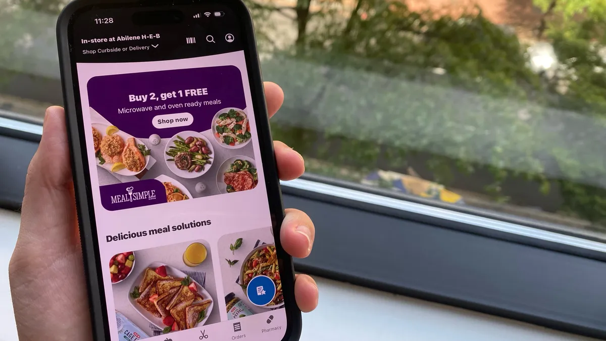
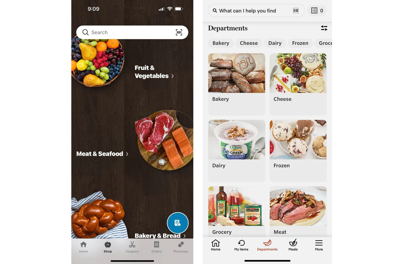
But diverse categories are not the only way to organize an app or show off aisle offerings. Wegmans and H-E-B, for instance, use photos.
H-E-B arguably has the sleekest app design, and the grocer’s categories each have a bright and bold image to accompany it. The photos pop even more as H-E-B’s background is designed to look like dark wood.
Wegmans may not be as aesthetically appealing as H-E-B’s, but its featured aisle photos match up nicely. The style mimics restaurant-quality meals, enticing shoppers and making it easy to find the category they’re looking for.
One-stop apps
Supermarkets today are not simply grocery stores anymore, but oftentimes caterers, bakeries, pharmacies and delivery services as well, meaning virtual apps need to live up to broader expectations.
Schnucks, Cub, Wegmans and H-E-B all give shoppers pharmacy access, whether that is by allowing them to refill prescriptions or find their nearest pharmacy.
These are not the only regional grocers that have pharmacies, however, just the ones that feature it on their primary app. Florida grocer Publix, despite having a significant pharmacy presence in its home state, requires its customers to download a separate app.
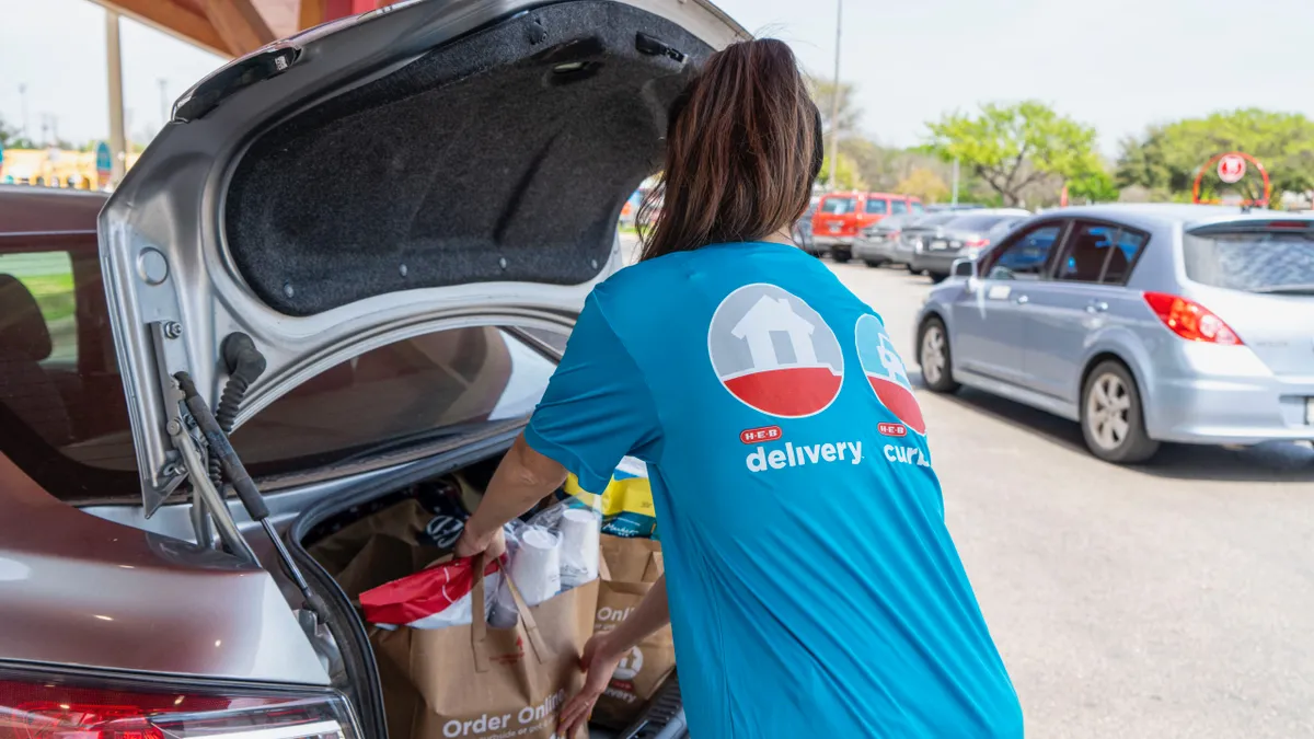
While most grocers offer features like delivery and curbside pickup though their grocery apps, Publix and ShopRite have separate platforms for the services, removing a level of convenience from the shopping experience. Publix offers it on its Publix Delivery & Curbside app, while ShopRite has a ShopRite Order Express app for products like deli meats, cheeses, meals-to-go, special occasion cakes, catering.
Cub is one of the regional grocery chains to pack almost everything into one app. The grocer offers pharmacy, pickup and delivery options on a single platform and also lets shoppers access their fuel rewards through the tool.


