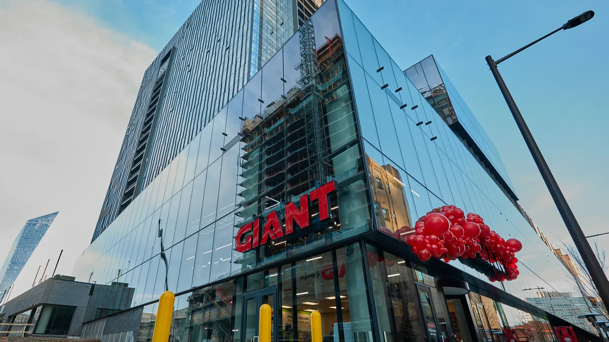
When officials at The Giant Company prepared to build the company's just-opened flagship location in Center City Philadelphia, they knew they wanted to develop a store tailored to the eclectic tastes that define Pennsylvania's largest city. But the design team faced a distinct challenge in creating a supermarket that would stand out in a densely populated urban area already replete with places to shop.
The solution the Ahold Delhaize-owned retailer devised fuses the core elements of a well-stocked grocery store with a broad set of regionally inspired features intended to help the new location connect with the local community despite being part of a nearly 200-store chain spread over four states.
"I don't want the store to just be a Giant store," said Paul Madarieta, director of urban retail for the company. "It has to be very Philadelphia because that's what's going to resonate to the customer."
Food, art and a river view
Along with 600 varieties of fruits and vegetables, a full-service meat department and a broad array of cheeses, the store, which opened on March 19, features a food hall with local vendors, work by Philadelphia artists and an outdoor terrace featuring views of the Schuylkill River.
The supermarket's selection of beer, wine and plant-based foods is the most extensive of any store in the Giant fleet. The store also carries an expanded selection of prepared foods and grab-and-go meals.
The new Giant supermarket, at 60 N. 23rd St., sits at the base of a residential tower in a development known as Riverwalk. To accommodate the restrictions of the space it occupies, the store is spread across two floors and features escalators alongside a "cartalator" that moves shopping carts.
The store's location inside an apartment complex is one of its most attractive features, because it reflects the retailer's goal of closely tying the store to the neighborhood it serves, Madarieta said.
"I can imagine people coming downstairs or coming into our building, maybe meeting a friend for coffee, or maybe meeting a friend for a beer, having some tacos together, having some sushi. And then at the end of that you're like, 'Wow, I'm in a grocery store! I'm going to actually go buy my groceries!'" said Madarieta.
The new Giant location draws heavily on the chain's three Heirloom Market stores in the city, according to Madarieta. While those urban-format stores are much smaller than the new location, they are designed to embrace the same kinds of urban challenges and themes — providing a roadmap as planners came up with a formula for the company's latest full-service grocery store, he said.
Drawing inspiration from other grocers
Beyond looking to the Heirloom locations for guidance, Madarieta and his colleagues examined grocery stores around the United States and overseas to spark ideas for the Riverwalk location. They visited stores in Chicago, New York and Washington, D.C., as well as supermarkets in London run by U.K. grocers Marks and Spencer, Tesco, Morrisons and Waitrose.
Madarieta said his previous experience working on the West Coast for Trader Joe's, which is known for adapting its store designs to unique spaces, also proved valuable as he refined concepts for the Philadelphia store.
"My view is that I want to give the customer the best experience," Madarieta said. "And if I need to borrow a little bit of that, and borrow something that I saw in Mexico, and bring together something I have from New York, and kind of meld it all together in a program that works really well for this particular customer, I think that's what we'll do."
Embracing columns instead of avoiding them
Rather than try to work around the columns supporting the tower above, for instance, planners incorporated the pillars spread across the 65,000-square-foot store into their marketing strategy by finding creative ways to use them to display products, Madarieta said. For example, a column near the bakery features a selection of processed meats, while one located elsewhere displays live plants.
"People were like, 'Oh, you've got columns,' and I'm like, 'Oh, no, we’ve got columns, it's so cool,' because you can actually flavor your store with different products and sprinkle in new items and do all these types of things," Madarieta said.
Encouraging shoppers to linger
The new supermarket also includes features that the Heirloom stores have shown to be effective at encouraging people to linger, like a wall featuring craft beers, wines, hard seltzer, cider and kombucha on tap.
Vendors in the store's food hall include branches of Mission Taqueria, a Mexican restaurant located a mile away, and Saladworks, which is based in the Philadelphia suburb of Conshohocken, Pennsylvania. Diners can also get sushi from Hissho Sushi as well as made-to-order sandwiches, flatbread pizzas, smoked meats, hot foods and gelato.
"We really want people to sit and stay. Because if you stay, the chances of you actually buying your groceries there are obviously heightened as well," Madarieta said. "It's not the old school kind of way — get them in and get them out. I actually want them to experience different parts" of the store.
The store was also designed to place items that shoppers might closely associate, like meat and spices, close together, according to Madarieta. Similarly, the food hall is located adjacent to the beer and wine section, and plant-based items are grouped together instead of being placed with the meat products they resemble.
"We couldn't think like traditional grocers as we laid out the store. We had to think about the customer journey" as it relates to local preferences, Madarieta said. "It should be how the customer needs to see it instead of how we operate within our four walls."


